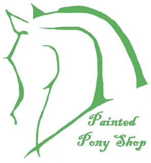
Lately, I've been doing a lot of thinking about a Painted Pony Shop logo. I usually use my green horse painting, "Connection", but I really wanted to come up with something a little more whimsical & loose, with clean lines that could easily be transferred to a business card or brochure. My objectives are to convey a natural, yet playful feeling, that looks professional and crisp. I took a road trip to Connecticut, to see family, an on the way back, I spent most of the six-hour drive sketching out some ideas. I had a few different layouts, but the one that really stood out to me was this:
 |
| Original Sketch |
When I got home, I transferred it to my computer, cleaned up the edges, stylized it a little, overlaid it with color, and added my shop name. I disconnected a lot of the lines, and varied the thickness of the strokes, so that it would have a more organic, freshly painted feel. Viola! The Painted Pony Shop logo was born....after several hours of tiresome trial-and-error, and lots of staring frustratedly at my computer screen, that is. The logo is still based loosely on my green horse painting, but is a much more business-friendly version. Any thoughts?
 |
| Final Product! |

No comments:
Post a Comment